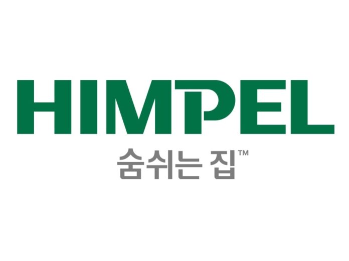
Himpel (CEO Kim Jeong-hwan) established the brand value of ventilation appliances based on 35 years of ventilation technology and carried out brand renewal for customer-centered innovation.
Himpel announced on the 23rd that it changed its CI (Corporate identity) to the Amazon green color and applied a new BI (Brand Identity) with the slogan of 'Breathing House' and a brand-specific color and exclusive font. This is the first renewal project in about 15 years since the company name was changed to Himpel in 2010. It was carried out to solidify its position as a specialized ventilation appliance brand with 35 years of experience and to strengthen the brand competitiveness of each product.
Himpel's CI has changed both in design and color. It boldly changed from the existing red color to 'Amazon Green' color. Just as the Amazon rainforest is called the lungs of the earth and plays an important role in the quality of the earth's air, Himpel ventilation appliances are also the lungs of the house, suggesting the importance of ventilation. In other words, it means that it is the optimal space that improves the quality of life of customers by considering air, health, environment, and technology.
The design concept of the logo emphasizes the 'ventilation power' that exchanges indoor and outdoor air in a house. The rectangular motif of 'P' signifies Himpel's ventilation appliances, and the breathing curve motif of inhalation and exhalation presents Himpel's vision of making the house breathe.
The slogan was set as 'Breathing Home' to convey the brand message by focusing on the benefits and experiences consumers enjoy through ventilation appliances. It means that a house, like a person, needs to breathe, and that we will protect the health of our families by creating a healthy house using ventilation products.
Himpel applied a new BI with brand colors and exclusive fonts that match the product lineup. This is to establish a brand image unique to Himpel products and strengthen the competitiveness of each product group.
System ventilation appliances applied a high-brightness green color reminiscent of nature and spring to reflect the comfortable image of the home, and bathroom ventilation appliances applied a lively orange color reminiscent of sunlight to emphasize warmth and comfort. In addition, kitchen ventilation appliances used purple to express an elegant and luxurious image, and living air appliances applied a clean and calm blue color to express professionalism and trustworthiness.
A Himpel official said, “Himpel has focused on researching ventilation technology and has recognized the importance of ventilation for a comfortable indoor environment and has been actively suggesting a proper ventilation culture,” adding, “We will now continue to think about how to grow into a ‘ventilation appliance specialty brand’ that allows customers’ homes to breathe.”
Meanwhile, Himpel's changed CI, BI, and slogan will be changed immediately and comprehensively starting this year and will be applied sequentially to official dealers.
- See more related articles
You must be logged in to post a comment.