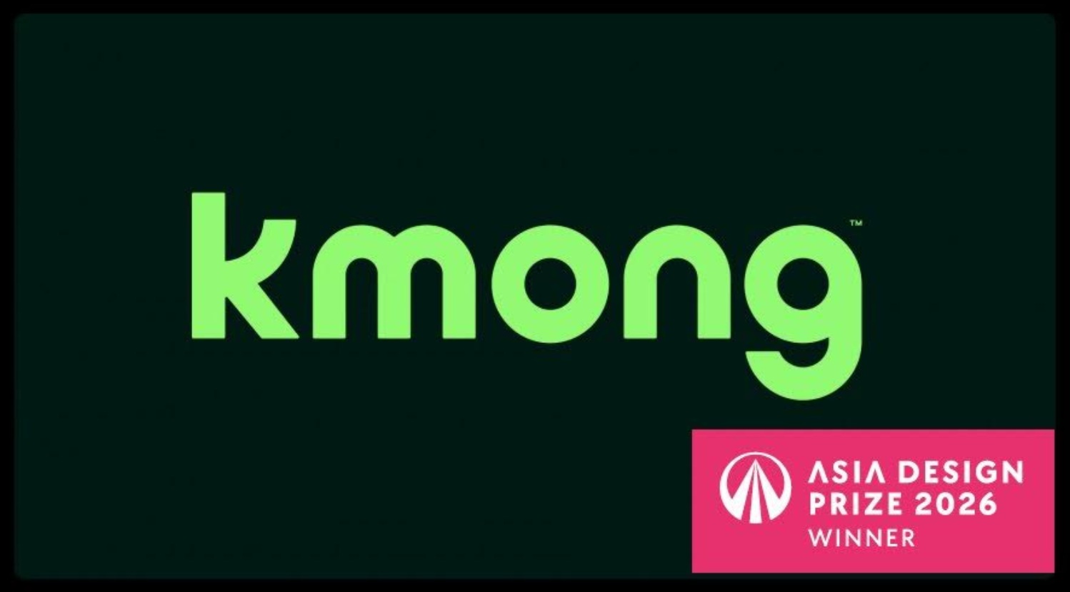
대한민국 대표 전문가 플랫폼 크몽이 ‘2026 아시아 디자인 프라이즈(ASIA DESIGN PRIZE)’ 커뮤니케이션 부문에서 본상(Winner)을 수상했다고 26일 밝혔다.
아시아 디자인 프라이즈는 전 세계 31개국이 참여하는 국제 디자인 어워드로, 디자이너와 기업이 혁신적인 디자인 가치를 선보이는 행사다. 2026년 어워드에는 약 1,500개 작품이 출품됐으며 39명의 글로벌 심사위원단이 공간·제품·커뮤니케이션 부문에서 심미성, 독창성, 실용성, 기술성 등을 종합 평가해 수상작을 선정했다.
크몽은 최근 단행한 리브랜딩 디자인을 통해 커뮤니케이션 부문 본상을 받았다. 이번 리브랜딩은 기존 원숭이 심볼 중심의 브랜드 이미지에서 벗어나 전문가 비즈니스 플랫폼으로서의 정체성을 강화하는 데 초점을 맞췄다. 핵심 디자인 요소인 알파벳 ‘K’ 워드마크에는 우상향 곡선을 적용해 플랫폼을 통한 전문가와 의뢰인의 동반 성장을 상징적으로 표현했다. 과거 브랜드 자산이었던 원숭이 꼬리 형태의 곡선을 현대적으로 재해석해 브랜드 헤리티지를 유지하면서도 전문적 이미지를 강화했다는 평가를 받았다.
색상 체계에도 변화가 있었다. 기존 ‘크몽 옐로우’에 신뢰와 성공을 상징하는 그린과 블랙을 조합해 전문성과 안정감을 강조했다. 온·오프라인 전반에서 일관된 톤앤매너를 구축하고, 국문 로고의 ‘ㅋ’과 ‘ㅇ’에는 성장의 의미를 담은 화살표 형태를 반영해 영문 로고와의 조형적 통일성을 확보했다.
크몽 관계자는 이번 수상이 리브랜딩을 통해 휴먼 클라우드 플랫폼으로서의 정체성을 강화한 성과를 국제적으로 인정받은 결과라고 밝혔다. 또한 강화된 브랜드 아이덴티티를 기반으로 전문가와 의뢰인 모두에게 일관된 브랜드 경험을 제공하고, 안정적이고 신뢰할 수 있는 비즈니스 환경을 조성해 나갈 계획이라고 전했다.
- 관련 기사 더 보기
Kmong Wins Grand Prize at the 2026 Asia Design Prize
Korea's leading expert platform, Cremon , announced on the 26th that it won the grand prize (Winner) in the Communication category of the '2026 Asia Design Prize'.
The Asia Design Prize is an international design award with participation from 31 countries around the world, where designers and companies showcase their innovative design values. Approximately 1,500 entries were submitted for the 2026 awards, and a 39-member global jury selected the winners based on a comprehensive evaluation of aesthetics, originality, practicality, and technical excellence in the categories of Space, Product, and Communication.
Kmong recently won the grand prize in the Communications category for its rebranding design. This rebrand shifted away from its previous monkey-centric brand image and focused on strengthening its identity as a professional business platform. The alphabet "K" wordmark, a key design element, features an upward curve, symbolizing the mutual growth of professionals and clients through the platform. The rebrand was praised for maintaining brand heritage while enhancing its professional image by reinterpreting the curved monkey tail, a past brand asset, in a modern way.
The color scheme has also undergone changes. The existing "Cream Yellow" has been combined with green and black, which symbolize trust and success, to emphasize professionalism and stability. A consistent tone and manner has been established across both online and offline channels, and the "ㅋ" and "ㅇ" in the Korean logo have been transformed into arrows symbolizing growth, ensuring a sculptural unity with the English logo.
A Kmong representative stated that this award represents international recognition for the company's efforts to strengthen its identity as a human cloud platform through rebranding. Furthermore, they stated that based on this strengthened brand identity, they plan to provide a consistent brand experience for both professionals and clients, and to foster a stable and trustworthy business environment.
- See more related articles
クモンが「2026アジアデザインプライズ」を受賞
大韓民国代表専門家プラットフォームクモンが「2026アジアデザインプライズ(ASIA DESIGN PRIZE)」コミュニケーション部門で本賞(Winner)を受賞したと26日明らかにした。
アジアデザインプライズは全世界31カ国が参加する国際デザインアワードで、デザイナーと企業が革新的なデザイン価値を披露するイベントだ。 2026年のアワードには約1,500作品が出品され、39人のグローバル審査委員団が空間・製品・コミュニケーション部門で審美性、独創性、実用性、技術性などを総合評価して受賞作を選定した。
クモンは最近断行したリブランディングデザインを通じてコミュニケーション部門本賞を受けた。今回のリブランドは、既存の猿シンボル中心のブランドイメージから抜け出し、専門家のビジネスプラットフォームとしてのアイデンティティを強化することに焦点を当てた。コアデザイン要素であるアルファベット「K」ワードマークには右上向き曲線を適用し、プラットフォームを通じた専門家と依頼人の同伴成長を象徴的に表現した。過去のブランド資産だった猿尾型の曲線を現代的に再解釈し、ブランドヘリテージを維持しながらも専門的なイメージを強化したという評価を受けた。
色体系にも変化があった。既存の「クモンイエロー」に信頼と成功を象徴するグリーンとブラックを組み合わせ、専門性と安定感を強調した。オン・オフライン全般で一貫したトーン&マナーを構築し、国文ロゴの「笑」と「ㅇ」には成長の意味を込めた矢印の形を反映して英文ロゴとの造形的統一性を確保した。
クモン関係者は今回の受賞がリブランディングを通じてヒューマンクラウドプラットフォームとしてのアイデンティティを強化した成果を国際的に認められた結果だと明らかにした。また、強化されたブランドアイデンティティを基盤として専門家と依頼人の両方に一貫したブランド体験を提供し、安定的で信頼できるビジネス環境を造成していく計画だと伝えた。
- 関連記事をもっと見る
Kmong 荣获 2026 年亚洲设计大奖
韩国领先的专家平台Cremon于 26 日宣布,它获得了“2026 亚洲设计奖”传播类别的最高奖项(优胜者)。
亚洲设计奖是一项国际设计奖项,来自全球31个国家的设计师和公司齐聚一堂,展示其创新设计理念。2026年亚洲设计奖共收到约1500份参赛作品,由39位国际评审团成员组成的评审团根据美学、原创性、实用性和技术卓越性等因素,在空间、产品和传播三大类别中评选出获奖者。
Kmong凭借其品牌重塑设计荣获传播类大奖。此次品牌重塑摒弃了以往以猴子为主题的品牌形象,着重强化其作为专业商业平台的定位。作为关键设计元素的字母“K”字标识采用向上弯曲的弧线,象征着专业人士和客户通过该平台共同成长。此次品牌重塑因在保留品牌传统的同时,通过对以往品牌元素——弯曲的猴尾——进行现代化的重新诠释,提升了其专业形象而备受赞誉。
配色方案也进行了调整。原有的“奶油黄”与象征信任和成功的绿色和黑色相结合,以强调专业性和稳定性。线上线下渠道的基调和风格保持一致,韩文logo中的“ㅋ”和“ㅇ”被替换成象征成长的箭头,与英文logo在视觉上形成统一。
Kmong公司的一位代表表示,该奖项是对公司通过品牌重塑强化其作为“人性化云平台”形象所做努力的国际认可。此外,他们还表示,基于这一强化后的品牌形象,公司计划为专业人士和客户提供一致的品牌体验,并营造稳定可靠的商业环境。
- 查看更多相关文章
Kmong remporte le Grand Prix du Design Asie 2026
Cremon , la principale plateforme d'experts de Corée, a annoncé le 26 qu'elle avait remporté le grand prix (lauréat) dans la catégorie Communication du « Prix du design asiatique 2026 ».
L'Asia Design Prize est un prix international de design qui réunit des participants de 31 pays du monde entier et où designers et entreprises présentent leurs créations innovantes. Environ 1 500 candidatures ont été soumises pour l'édition 2026, et un jury international composé de 39 membres a sélectionné les lauréats sur la base d'une évaluation complète de l'esthétique, de l'originalité, de la fonctionnalité et de l'excellence technique dans les catégories Espace, Produit et Communication.
Kmong a récemment remporté le grand prix dans la catégorie Communication pour son rebranding. Ce changement d'image marque une rupture avec l'ancienne identité centrée sur le singe, et vise à renforcer son positionnement de plateforme professionnelle. Le logo « K », élément clé du design, présente une courbe ascendante, symbolisant la croissance mutuelle des professionnels et des clients grâce à la plateforme. Le rebranding a été salué pour avoir préservé l'héritage de la marque tout en valorisant son image professionnelle grâce à une réinterprétation moderne de la queue de singe incurvée, un ancien emblème de la marque.
La palette de couleurs a également été modifiée. Le jaune crème existant a été associé au vert et au noir, symboles de confiance et de réussite, afin de souligner le professionnalisme et la stabilité. Une cohérence de ton et de style a été instaurée sur les canaux en ligne et hors ligne, et les caractères « ㅋ » et « ㅇ » du logo coréen ont été transformés en flèches symbolisant la croissance, assurant ainsi une unité visuelle avec le logo anglais.
Un représentant de Kmong a déclaré que ce prix témoigne de la reconnaissance internationale des efforts déployés par l'entreprise pour renforcer son identité de plateforme cloud humaine grâce à une refonte de son image de marque. Il a ajouté que, forte de cette identité de marque renforcée, l'entreprise prévoit d'offrir une expérience de marque cohérente aux professionnels comme aux clients et de favoriser un environnement commercial stable et digne de confiance.
- Voir plus d'articles connexes
You must be logged in to post a comment.